Daytrip is a content platform where top travel and lifestyle influencers curate the highest quality
spaces in South Korea. Working part-time since May 2020, I designed and launched the iOS app as their
founding designer.
The following is a peek into my process for a redesign leading into V2
of the app.
Context
Early 2021 (4 weeks)
Consumer mobile app
Tools
Figma, Principle
Problem
Solving a disappointing discovery experience
For people using Daytrip to find interesting places to go to in Seoul, the Search tab is a
disappointing experience due to unreliable filters and lack of context awareness.
Improving the experience would reduce churn, especially since most people immediately make a beeline
for the Search tab after onboarding.
Insights
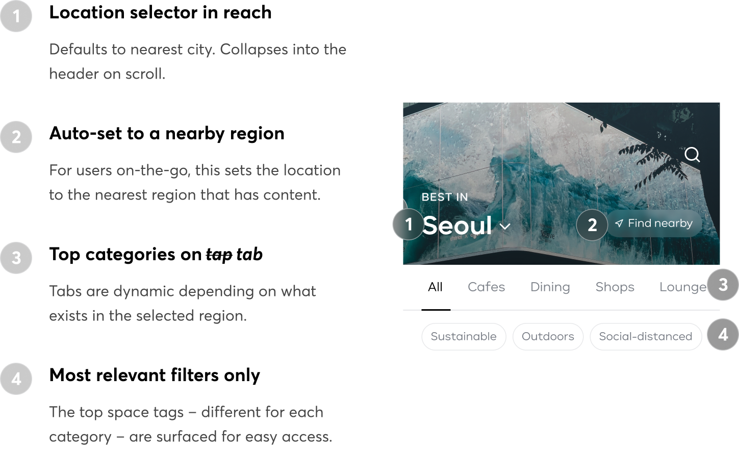
Location, location, location
From the usage data, I saw how often – and immediate – people filtered or search by region during their session. Based on past interviews conducted by other team members, I also knew that people used Daytrip in 3 main scenarios:
Finding somewhere nearby #on-the-go
Discovering hidden gems in a neighborhood #browsing
Planning a weekend trip (e.g. to Busan, another major city in South Korea) #planning
Takeaway: Let people set their location context upfront so that the experience of the session can adapt to their needs in each scenario.
Static preferences fall short
Daytrip has a preference-selection feature (that feeds into a personalized Home tab), but it assumes people's preferences are static. It turns out that depending on the time of day, day in the week, and seasonality, people are looking for different things. For example, there are more searches for restaurants around dinner time. And there is way more interest in outdoor spaces during these *cough* *cough* times.
Takeaway: Help people find relevant content more easily by surfacing the most timely space types and attributes.
Design
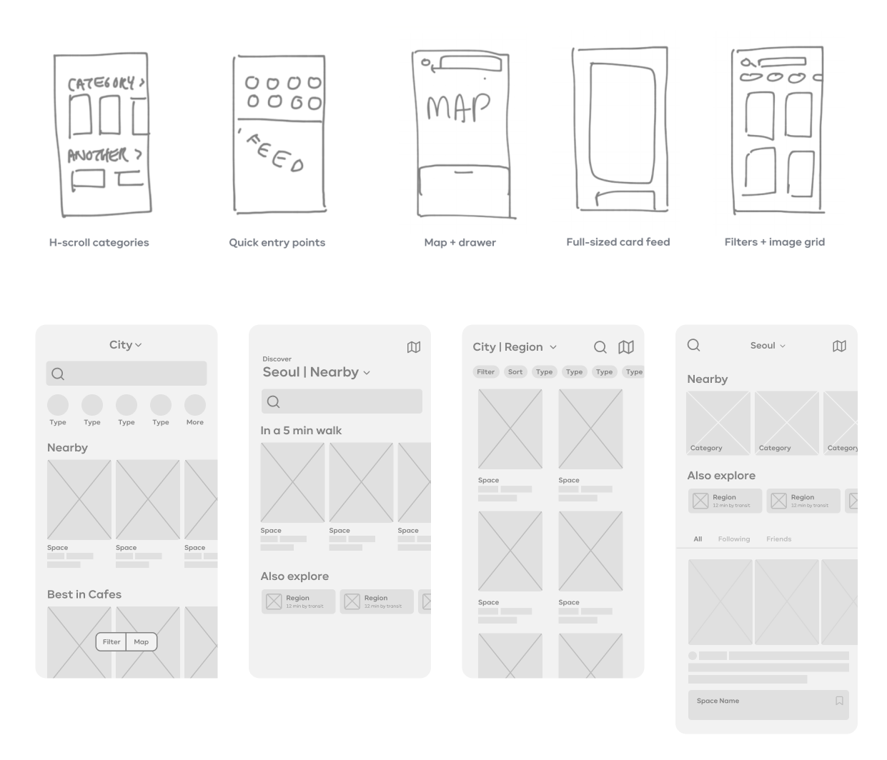
Go broad, then narrow
Because our goals for the redesign included identifying business opportunities and aligning with
future product direction, I led the rest of the team (3 other members across product, engineering, and marketing) through a round of ideation. We converged after compiling interaction patterns from apps our users were likely familiar with, and I wireframed some
quick explorations for discussion.
To focus on problem-solving, I was also wireframing for the secondary screens. The following two proposals were implemented using existing design components and immediately shipped.
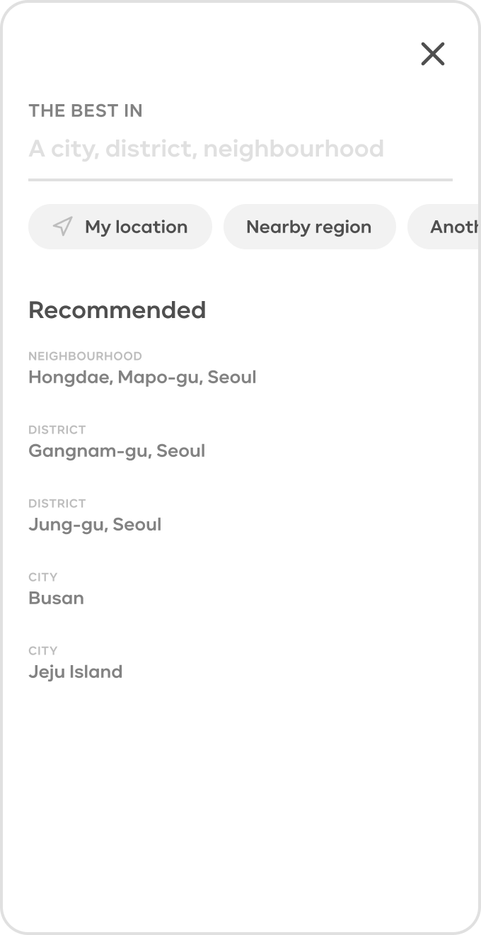
Problem: Selecting the location of interest is difficult
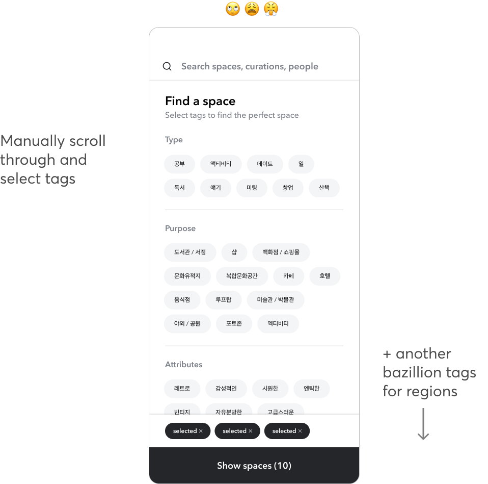
We previously displayed region tags for users to filter with (i.e. one tag per every neighbourhood in Seoul's 25 districts + other cities). Selecting them one-by-one made for a tiring and unintuitive user experience – what if I just want to see everything in one district instead of selecting all the individual neighbourhood tags? So, some people just used the search bar to query for location...and others built ungainly multi-tag queries.
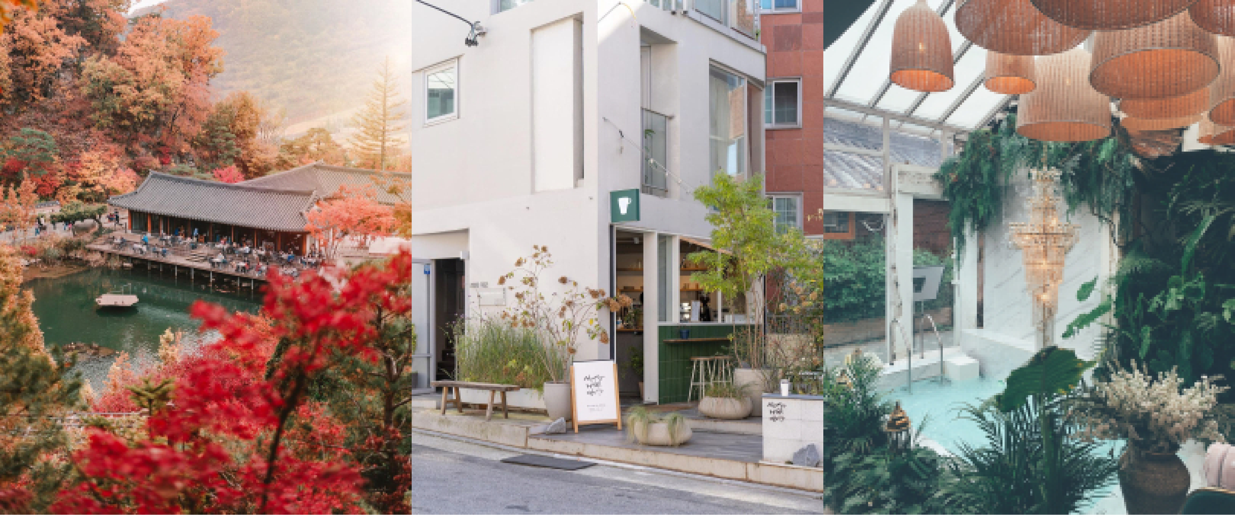
The solution shown below is a location selector view that emphasizes the handful of regions that make up the largest chunk of interest (based on the usage data). Nearby regions are also surfaced for easy access. If someone has a different region in mind, they can simply find it through the embedded search bar.
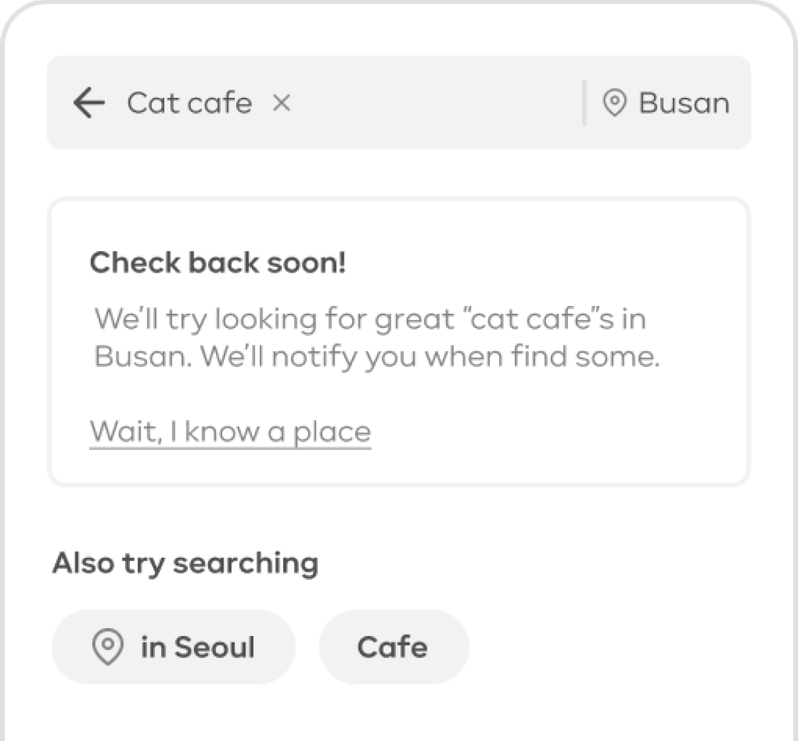
Problem: Disappointment due to lack of content or irrelvant results
When people use the search bar, their queries are tend to be quite specific – and perhaps not
very suitable for Daytrip's currently limited database and search functionality. A common occurrence was seeing people
repeatedly make search attempts, even modifying their query to try again when they
couldn't find what they were looking for. The lack-of-content problem also came up when people selected regions that just didn't have much.
Whenever possible, the app should make suggestions for other queries/filters to try. Additionally, sending
notifications in the future when the content exists (and encouraging space suggestions) is chance to
re-engage people who would have not come back otherwise.
De-risk and ship for now
Due to a time-crunch to line up with the easing of restrictions in Seoul, the following is the
version we briefly tested with 3 current users and shipped. Instead of showing all the tag filters at the gate, content is available upfront. This was the safest option (considering how people may have imprinted on the original menu of filters) and required minimal dev work.
This release was only a temporary compromise. Filtering activity increased and use of the search bar decreased – which is good since search is more cognitively demanding – but we weren't seeing much change in the metrics that mattered. Plus, an unsatisfied app store review still noted
frustration at "search [being] too difficult".
Polishing for the 2nd release
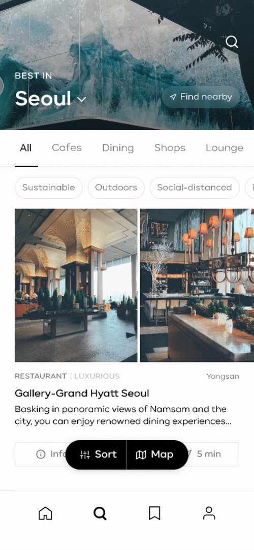
With a little more time and bandwidth on the development side to work with, I made visual refinements to the hiearchy of the Search (now technically the "Discover") tab's initial view:
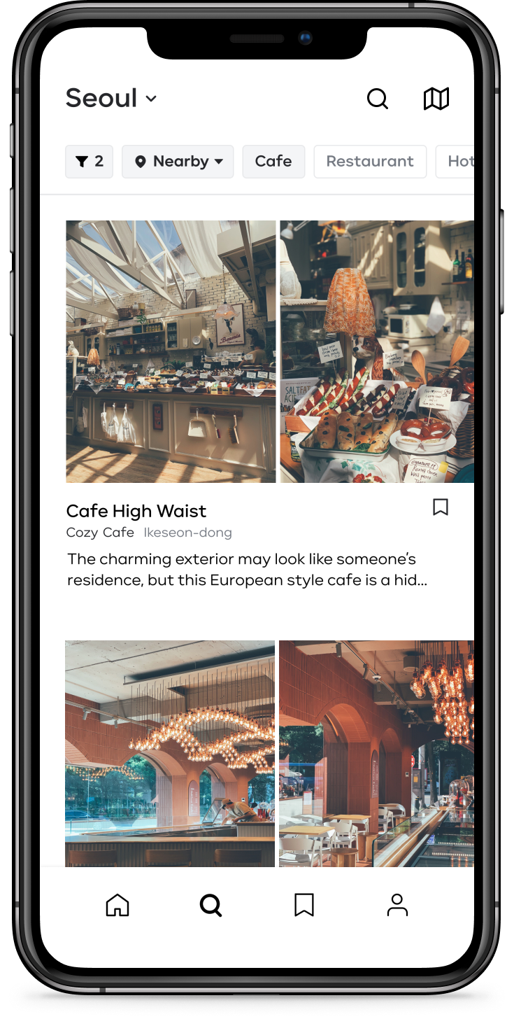
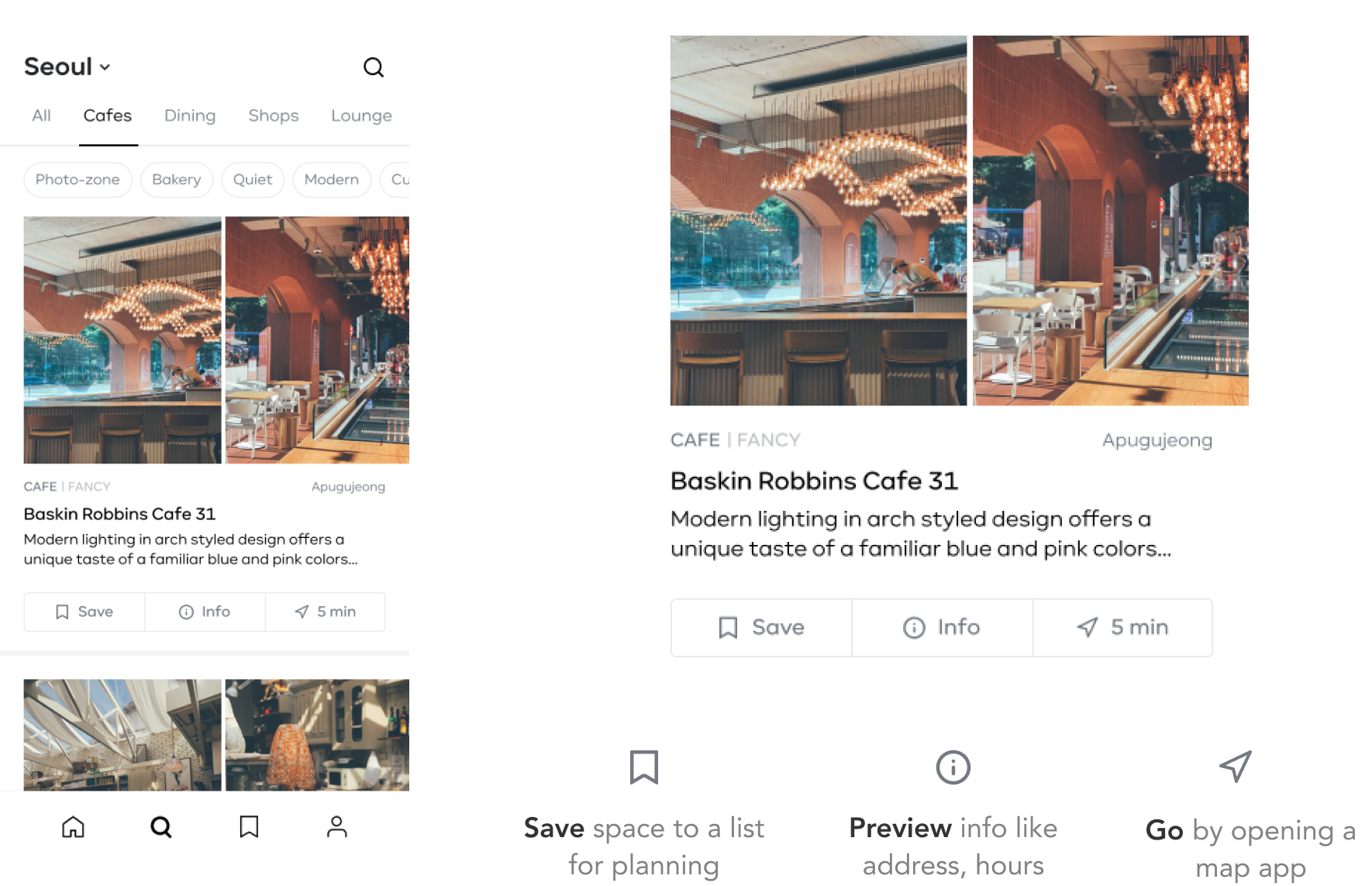
Card design upgrade
While this does not relate to the main problem, I want to provide some more context as to why the cards displaying the spaces are designed this way. Each space on Daytrip has content (photos and text posts) from curators. One post is featured and visible from the list for each space. A space's photos have been emphasized ever since V1 after hearing how the emotional impact of beautiful photos are key in getting people interested in visiting.
The decision to now include the 3 action buttons came from discovering small gaps in the discovery journey (using the jobs-to-be-done framework). Before, people could only access the save-to-a-list feature. If they actually wanted to go, they had to tap into the details view to manually copy & paste the address elsewhere. The info button is included because people may sometimes tap on the card to read more of the featured post, and other times they need to get directly to the logistical info.
Here's also a nice-to-have animation to make the meaning of the navigation minutes (the shortest time by
either
walking or Seoul's public transit) more clear:
Measuring success
The polished design is now in development partially released, with a bit more dev work underway. The team is keeping an eye on the average # of spaces users save per session. This metric is based on the "aha moment" where people who return to the app usually save ~5 spaces on their first session. So if the redesigned search tab does a better job of helping people find relevant spaces to visit, we should see an increase in the saves – and later on, the check-ins.
Thank you for reading! This post will be updated as I monitor the results. If you are curious about what the app is like right now (and don't mind it being all in Korean), you can check it out on iOS here.